Industry

Public Services

Client

Client

Australian Department of Health

Reimagining how Australians claim medical expenses

Reimagining how Australians claim medical expenses

Main Project Image
Main Project Image
Main Project Image
  • Accessibility-First Design

  • Inclusive Design

  • Design System Implementation

  • Multidisciplinary Collaboration

  • End-to-End UI Redesign

  • Accessibility-First Design

  • Inclusive Design

  • Design System Implementation

  • Multidisciplinary Collaboration

  • End-to-End UI Redesign

  • Accessibility-First Design

  • Inclusive Design

  • Design System Implementation

  • Multidisciplinary Collaboration

  • End-to-End UI Redesign

At a glance

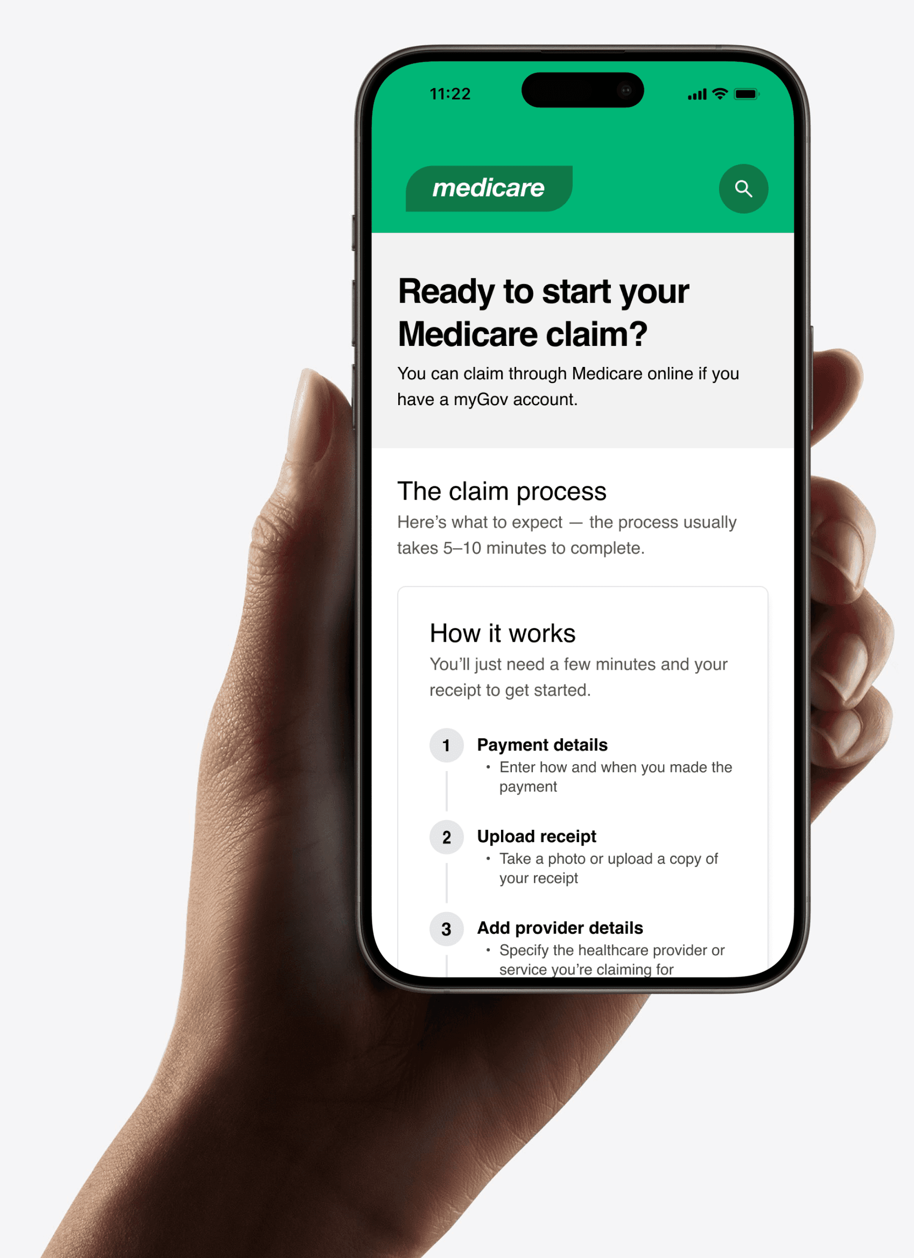
Working with the Australian Government, we redesigned the Medicare digital experience to be clearer, fairer, and more inclusive. A key focus was improving the claims process — helping millions of people recover medical costs more easily by making the service faster, simpler, and more transparent.

My Role

Product designer

Product engineer

Researcher

Team

Product owner

Project manager

Business analyst

UX researchers

Content designers

Service designer

Software engineers

Front-end developers

Quality analyst

Year

2019

Tools

Sketch

Invision

Flinto

Figma

Confluence

My Role

I was the design lead for the Medicare claim redesign, working with product managers, developers, content designers and policy makers. I ran workshops, user research and testing, defined key problems and opportunities, designed and prototyped mobile-first solutions, and co-developed high-fidelity UI with developers.

I was the design lead for the Medicare claim redesign, working with product managers, developers, content designers and policy makers. I ran workshops, user research and testing, defined key problems and opportunities, designed and prototyped mobile-first solutions, and co-developed high-fidelity UI with developers.

The design

Preparing users before they start their claim

Preparing users before they start their claim

Using staged disclosure we introduced a short questionnaire to check if users had the right documents. If users didn’t have the required documents, they were redirected out of the claim flow — saving time and preventing abandoned claims. This helped users feel prepared, reduced mid-way drop-offs, and increased claim completion rates.

The process is buried, time consuming, and unclear.

The Challenge

For Australians, making a Medicare claim was confusing, time-consuming, and uncertain. Users worried about delays in receiving refunds, struggled with a mobile experience that wasn’t built for real-life use, and often abandoned claims to hunt for missing documents. The process wasn’t just inefficient — it pushed users into call centres and Medicare branches, increasing pressure on support services at a time when they were already stretched.

For Australians, making a Medicare claim was confusing, time-consuming, and uncertain. Users worried about delays in receiving refunds, struggled with a mobile experience that wasn’t built for real-life use, and often abandoned claims to hunt for missing documents. The process wasn’t just inefficient — it pushed users into call centres and Medicare branches, increasing pressure on support services at a time when they were already stretched.

Baseline Insights

We analysed historical claims, web analytics and tested early journeys with users. Analytics revealed high drop-off rates, slow completion times and low satisfaction. Claim data highlighted what successful and failed submissions looked like. User testing helped us understand why — overwhelming forms, missing documents, a poor mobile experience and uncertainty around refunds.

60%

Of users abandoned their claim midway

60%

Of users abandoned their claim midway

60%

Of users abandoned their claim midway

1.5/5

Customer satisfaction score

1.5/5

Customer satisfaction score

1.5/5

Customer satisfaction score

90%

Of users felt overwhelmed by the information required

90%

Of users felt overwhelmed by the information required

90%

Of users felt overwhelmed by the information required

12 mins

Average time to complete a claim

12 mins

Average time to complete a claim

12 mins

Average time to complete a claim

70%

Abandoned their claim due to missing documents

70%

Abandoned their claim due to missing documents

70%

Abandoned their claim due to missing documents

80%

Found the mobile experience frustrating

80%

Found the mobile experience frustrating

80%

Found the mobile experience frustrating

Hypothesis

Clear requirements, a simplified step-by-step claim flow and a mobile-friendly experience will increase successful submissions and reduce pressure on customer support channels

The design

Preparing users before they start their claim

Using staged disclosure we introduced a short questionnaire to check if users had the right documents. If users didn’t have the required documents, they were redirected out of the claim flow — saving time and preventing abandoned claims. This helped users feel prepared, reduced mid-way drop-offs, and increased claim completion rates.

From long forms to simple steps

We simplified the claim flow using staged disclosure — breaking it into smaller, logical sections where users only provide what’s needed at each step. This reduces cognitive load, keeps users moving forward, and makes the process feel easier to complete.

Designing for mobile

Most claims began on mobile, but the journey had been designed for desktop. Long forms, dense layouts and non-responsive components made the process slow and frustrating — especially for people submitting claims on the go. We rebuilt the experience mobile-first: fewer fields, responsive layouts and clearer guidance, making claims faster to complete and far less likely to be abandoned.

Cards instead of tables

Service items were previously displayed in dense tables that didn’t translate to mobile. They required horizontal scrolling, buried key details and made comparison difficult. We redesigned them as compact, expandable cards that surface essential information up front. Users can quickly scan, tap for more detail and remove items without losing their place. → Faster to review, works on any screen, and dramatically reduces visual clutter.

Inline errors, not dead ends

We improved error handling by introducing real-time, inline validation and clearer, more actionable messages. Instead of forcing users to wait until submission to discover mistakes, the form now guides them as they type — reducing frustration and helping them complete claims with confidence. → Fewer mistakes, clearer guidance, and fewer abandoned forms.

Measured Outcomes

The redesigned claim flow led to faster submissions, fewer drop-offs, and higher user satisfaction. Results are based on 2,500 live claims, post-launch analytics, and Department of Health satisfaction surveys.

25%

Decrease in time to completion, from 12 minutes to 9 minutes

25%

Decrease in time to completion, from 12 minutes to 9 minutes

25%

Decrease in time to completion, from 12 minutes to 9 minutes

75%

Decrease in drop-offs, from 60% to 15%

75%

Decrease in drop-offs, from 60% to 15%

75%

Decrease in drop-offs, from 60% to 15%

70%

Increase in customer satisfaction, from 1.5 to 2.5 out of 5

70%

Increase in customer satisfaction, from 1.5 to 2.5 out of 5

70%

Increase in customer satisfaction, from 1.5 to 2.5 out of 5

Conclusion

This project showed me that design at scale is about more than efficiency gains — it’s about building trust in critical services. By proving that inclusive, evidence-based design could work inside government, I learned how collaboration and persistence can drive meaningful change, even in the most complex institutions.